> ## Documentation Index
> Fetch the complete documentation index at: https://learn.catalogbuilderapp.com/llms.txt
> Use this file to discover all available pages before exploring further.
# Content Tab (Identity & Settings)
> Learn how to configure catalog title, slogan, cover images, table of contents, organization contact pages, and currency settings in the Content Tab.
The **Content Tab** in the Catalog Editor allows you to customize the core brand identity, front cover artwork, introductory texts, automated special pages, and global currency formatting for your catalog.
 ***
## Catalog Identity
Set the foundational brand headlines that define your publication:
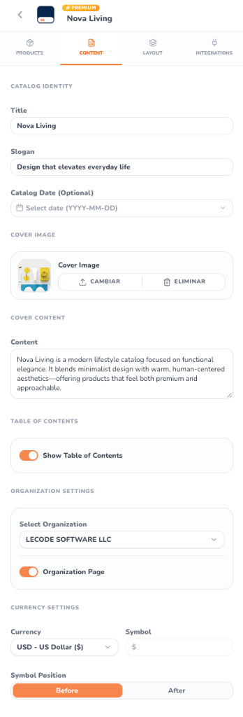
* **Title**: The primary name of your catalog (e.g., `Nova Living`). This title appears prominently on the front cover, header navigation, and PDF title metadata.
* **Slogan**: A brand tagline or collection theme (e.g., `Design that elevates everyday life`) displayed right below the catalog title.
* **Catalog Date (Optional)**: An interactive date selector (`YYYY-MM-DD`) to timestamp the edition, seasonal campaign (e.g., Spring/Summer), or promotional validity period.
***
## Cover Image
The cover image establishes the visual tone for the entire publication:
* **Live Thumbnail**: Displays a preview of your active cover photo.
* **Upload / Replace (`Cambiar`)**: Upload high-resolution cover artwork (supports JPG, PNG, and WebP up to 50MB). The editor automatically scales and positions the image to fit your chosen template's cover bleed.
* **Remove (`Eliminar`)**: Clears the custom cover image, allowing you to use a minimalist typographic layout or color gradient background.
***
## Cover Content
Provide an inviting narrative for readers opening your catalog:
* **Content Area**: A multi-line textarea for your introduction, brand manifesto, or curated product collection message.
* **Live Synchronization**: As you type, the cover layout on the central canvas updates instantly.
***
## Table of Contents
CatalogBuilderApp takes the hassle out of manual pagination:
* **Show Table of Contents Switch**: Toggle automated index generation on or off with a single click.
* **Dynamic Categorization**: When enabled, the editor inserts a beautifully formatted **PAGE 2 — ÍNDICE** listing your product categories and chapters alongside their live page numbers.
* **Zero-Maintenance Pagination**: Whenever you add, remove, or rearrange products, the Table of Contents updates its page numbers automatically.
***
## Organization Settings & Contact Page
Turn the final page of your catalog into a conversion driver:
* **Select Organization**: Associate the catalog with one of your registered business profiles.
* **Organization Page Switch**: Enable the automated back cover / contact page.
* **Automatic Contact Layout**: Renders your organization's official logo, registered business name, physical address, support phone numbers, website, and social media channels.
***
## Currency Settings
Standardize price formatting across all product cards and grid layouts:
Choose from popular global currencies including **USD** ($), **EUR** (€), **GBP** (£), **CAD** (C$), **MXN** (\$), **HNL** (L.), or select **CUSTOM** to define your own national currency code.
When **CUSTOM** currency is selected, define any symbol or abbreviation to match regional accounting standards.
Toggle between **Before** (e.g., `$1,299.00`) or **After** (e.g., `1.299,00 €`) via the segmented control to adhere to your market's typographical conventions.
Eliminates inconsistencies by formatting prices across all product presets, half-page spreads, and full-page features simultaneously.
This documentation is built and hosted on [Mintlify](https://mintlify.com), a developer documentation platform.
***
## Catalog Identity
Set the foundational brand headlines that define your publication:
* **Title**: The primary name of your catalog (e.g., `Nova Living`). This title appears prominently on the front cover, header navigation, and PDF title metadata.
* **Slogan**: A brand tagline or collection theme (e.g., `Design that elevates everyday life`) displayed right below the catalog title.
* **Catalog Date (Optional)**: An interactive date selector (`YYYY-MM-DD`) to timestamp the edition, seasonal campaign (e.g., Spring/Summer), or promotional validity period.
***
## Cover Image
The cover image establishes the visual tone for the entire publication:
* **Live Thumbnail**: Displays a preview of your active cover photo.
* **Upload / Replace (`Cambiar`)**: Upload high-resolution cover artwork (supports JPG, PNG, and WebP up to 50MB). The editor automatically scales and positions the image to fit your chosen template's cover bleed.
* **Remove (`Eliminar`)**: Clears the custom cover image, allowing you to use a minimalist typographic layout or color gradient background.
***
## Cover Content
Provide an inviting narrative for readers opening your catalog:
* **Content Area**: A multi-line textarea for your introduction, brand manifesto, or curated product collection message.
* **Live Synchronization**: As you type, the cover layout on the central canvas updates instantly.
***
## Table of Contents
CatalogBuilderApp takes the hassle out of manual pagination:
* **Show Table of Contents Switch**: Toggle automated index generation on or off with a single click.
* **Dynamic Categorization**: When enabled, the editor inserts a beautifully formatted **PAGE 2 — ÍNDICE** listing your product categories and chapters alongside their live page numbers.
* **Zero-Maintenance Pagination**: Whenever you add, remove, or rearrange products, the Table of Contents updates its page numbers automatically.
***
## Organization Settings & Contact Page
Turn the final page of your catalog into a conversion driver:
* **Select Organization**: Associate the catalog with one of your registered business profiles.
* **Organization Page Switch**: Enable the automated back cover / contact page.
* **Automatic Contact Layout**: Renders your organization's official logo, registered business name, physical address, support phone numbers, website, and social media channels.
***
## Currency Settings
Standardize price formatting across all product cards and grid layouts:
Choose from popular global currencies including **USD** ($), **EUR** (€), **GBP** (£), **CAD** (C$), **MXN** (\$), **HNL** (L.), or select **CUSTOM** to define your own national currency code.
When **CUSTOM** currency is selected, define any symbol or abbreviation to match regional accounting standards.
Toggle between **Before** (e.g., `$1,299.00`) or **After** (e.g., `1.299,00 €`) via the segmented control to adhere to your market's typographical conventions.
Eliminates inconsistencies by formatting prices across all product presets, half-page spreads, and full-page features simultaneously.
This documentation is built and hosted on [Mintlify](https://mintlify.com), a developer documentation platform.