
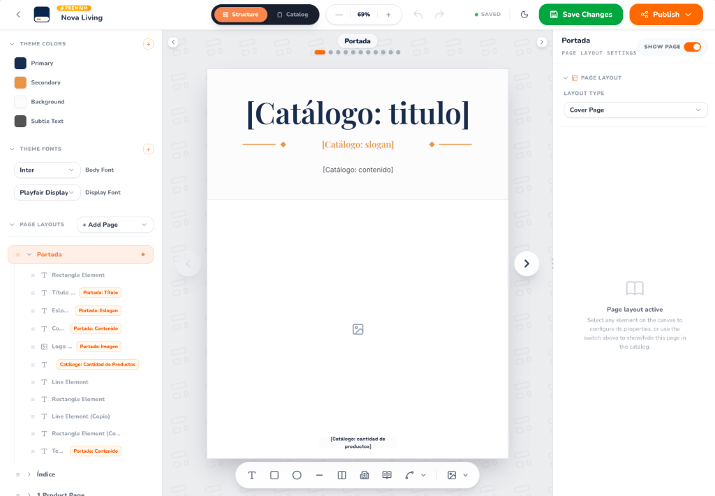
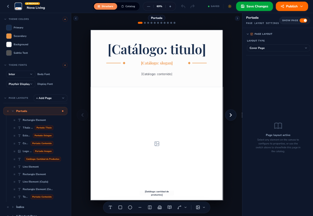
Template Builder Visual Canvas (Structure Mode) — Light & Dark Modes
Universal Access: Open Template Mode From Any Catalog
In CatalogBuilderApp, templates are not rigid external files. Every catalog has direct access to the Template Builder through the unified editor interface.Switch Modes Anytime: You can toggle between Catalog Mode (managing inventory and content) and Structure / Template Mode at any moment using the segmented pill control at the top of the screen:
[ ⊞ Structure ] ⟷ [ 🕮 Catalog ]- Zero Data Loss: Your existing products, descriptions, and catalog texts are preserved while you edit the underlying master structure.
- Real-Time Dynamic Tokens: The canvas displays placeholder tokens (such as
[Catálogo: titulo],[Catálogo: slogan], and[Catálogo: cantidad de productos]) showing exactly where catalog information will populate. - Instant Propagation: Any layout changes, color palette tweaks, or font updates you save in Structure mode automatically reflect across all pages when you switch back to Catalog mode.
Why Use the Template Builder?
While CatalogBuilderApp includes a rich gallery of pre-built professional templates, the Template Builder gives you total creative freedom to build tailored publications aligned with your brand identity:Personalized Master Templates
Define unique page dimensions, margins, decorative vector elements, background accents, and bespoke branding guidelines.
Custom Page Layouts
Design dedicated layouts for every stage of your catalog: cover pages, table of contents, single-product feature pages, multi-product grids, and contact back covers.
Reusable Component Presets
Build modular product card presets, price tags, badge containers, and image frames once. The engine automatically repeats them for every product.
Global Theme Tokens
Bind colors and fonts to global variables. Changing a primary theme color or body font updates every element across the entire catalog instantly.
Workspace Tour
The Template Builder interface provides professional design tools organized into three functional zones:1. Left Control Panel: Structure & Hierarchy
- Theme Colors:
- Centralized palette containing Primary, Secondary, Background, and Subtle Text color tokens.
- Add custom global colors with the
+button to keep your design strictly on-brand.
- Theme Fonts:
- Configure global typography pairings: Display Font (for bold titles and headings, e.g., Playfair Display) and Body Font (for readable descriptions and prices, e.g., Inter).
- Page Layouts Tree:
- Add new page types using the + Add Page dropdown button.
- Expand each layout (such as Portada, Índice, or 1 Product Page) to inspect and manage its layer hierarchy:
- Text elements, titles, and dynamic slogans.
- Vector shapes, divider lines, and decorative rectangles.
- Image dropzones and dynamic product count tags.
- Drag and drop layers to adjust stacking order (z-index) and nesting.
2. Interactive Canvas & Bottom Vector Dock
The central workspace delivers a live editing canvas:- Dynamic Token Placeholders: Visual placeholders clearly indicate where catalog metadata and product fields will dynamically appear.
- Navigation Controls: Switch between template pages using the pagination dots and navigation arrows (
<,>). - Floating Bottom Vector Dock: A streamlined toolbar with vector creation and annotation tools:
- Text Tool (
T): Insert custom static text or dynamic tag fields. - Geometric Shapes: Draw rectangles, rounded containers, ellipses, and horizontal/vertical divider lines.
- Layout Splitters & Grids: Insert multi-column containers for product grids.
- Component Preset Slot: Place reusable product card containers.
- Vector Pen & Bezier Curves: Craft custom vector illustrations and dividers.
- Custom Image Upload: Insert brand logos, watermarks, or background graphics.
- Text Tool (
3. Right Panel: Inspector & Page Settings
Selecting any page or element activates the contextual inspector on the right:- Layout Tabs: Toggle between PAGE, LAYOUT, and SETTINGS.
- Page Visibility Toggle (
SHOW PAGE): Turn the switch on or off to include or exclude a specific page layout from the final catalog publication. - Layout Type Selector: Assign the page classification (e.g., Cover Page, Table of Contents, Products Page, or Back Cover).
- Element Properties: When an element is selected on the canvas, inspect and tweak its coordinates, dimensions, typography, border radius, fill color, and stroke settings.
4. Top Header Bar
- Catalog / Template Name: Click to rename your template directly in place.
- Mode Toggle Pill: Smoothly switch between Structure and Catalog modes.
- Zoom Capsule: Adjust canvas zoom smoothly (
- 69% +) for precise alignment. - History (Undo / Redo): Revert or reapply actions with full state tracking.
- Save Status Indicator: Live status indicator (
Saved,Saving,Unsaved). - Theme Switcher: Toggle the interface between Dark and Light mode.
- Save Changes Button: Persist all template modifications to your catalog.
- Publish: Export the catalog as a digital Flipbook or vector PDF.
How Templates Power Your Products
The Template Builder operates hand-in-hand with the Catalog Editor’s Products and Layout tabs:- In the Template Builder, you define how a product card looks (image placement, title font, price badge, SKU tag).
- In the Products Tab, you assign layout priorities to your inventory (COMPLETA / Full Page, MEDIA / Half Page, or CUADRÍCULA / Grid).
- The catalog engine automatically merges your actual inventory with the template’s component presets—generating balanced, professional pages without manual copy-pasting.