
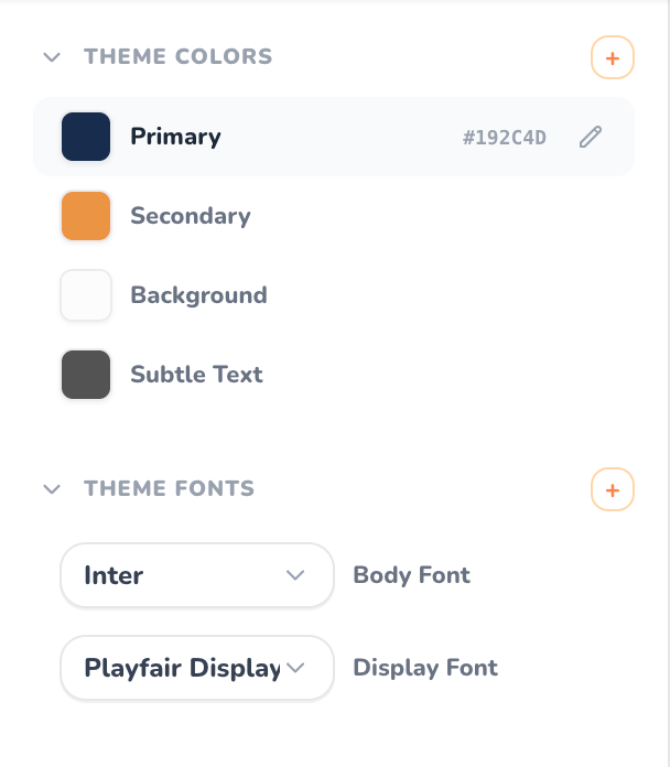
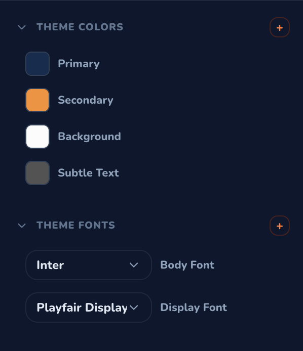
Theme Colors & Theme Fonts Panels in the Template Builder — Light & Dark Modes
Why Use Theme Variables?
When designing multi-page catalogs with hundreds of products, updating a color or changing a brand typeface across every individual element is time-consuming and error-prone. With Theme Variables:- Instant Cascading Updates: Change a color swatch or font pairing once, and every bound element across your catalog updates in real time.
- Brand Consistency: Ensure every product card, price badge, header, and divider line adheres strictly to your brand guidelines.
- Unlimited Flexibility: Create, rename, edit, or delete as many custom colors and typography roles as your publication requires.
Theme Colors
The Theme Colors accordion in the left sidebar manages all global color swatches.1. Default System Colors
Every template initializes with core tokens:- Primary: The main brand accent color, typically applied to headlines, prominent callouts, and key interaction buttons.
- Secondary: A complementary accent tone used for secondary badges, price highlights, and borders.
- Background: The base canvas tone for pages and containers (e.g., clean white, slate, or warm cream).
- Subtle Text: A muted tone for SKU numbers, dimension labels, specifications, and fine print.
2. Creating Custom Colors
You can create an unlimited number of custom color tokens:- Click the orange
+button in the THEME COLORS header. - A new custom color token is generated automatically.
- Click the color swatch box to open the color picker.
- Select your desired shade or enter an exact 6-character HEX code (e.g.,
#192C4D).
3. Editing and Renaming Colors
- Change Swatch: Click the square color preview anytime to update the hex value.
- Rename Variable: Double-click the label or click the pencil icon (
✎) that appears on hover. Enter a descriptive title (such as Gold Accent, Sale Badge, or Border Gray). Spaces are automatically converted to clean system tokens. - Live HEX Inspector: Hover over any color row to reveal its exact hex code on the right side.
4. Deleting Custom Colors
- Hover over any custom color row to reveal the red trash can icon (
🗑️). - Click the icon to permanently delete the custom variable.
- (Note: Core tokens like
Primary,Secondary, andBackgroundare protected from deletion to safeguard template layout integrity).
Theme Fonts
The Theme Fonts section governs the typographic hierarchy across your template.1. Default Typography Roles
- Display Font: An expressive, high-impact font family curated for catalog titles, cover headlines, and hero product names (e.g., Playfair Display, Cinzel, Montserrat).
- Body Font: A clean, highly legible typeface engineered for descriptions, specifications, pricing, and table of contents entries (e.g., Inter, Roboto, Outfit).
2. Creating Custom Font Roles
Need dedicated typography for special elements? You can create as many custom font roles as you need:- Click the orange
+button in the THEME FONTS header. - A new custom font variable is created.
- Select the font family from the searchable dropdown list.
- Double-click the name or click the pencil icon (
✎) to give it a role name (such as Price Tag Font, Disclaimer Font, or Badge Font).
3. Editing & Deleting Fonts
- Change Family: Use the font picker dropdown to browse professional Google Fonts and web-safe typography.
- Change Weight: Select variant weights (Regular, Medium, Bold, Extra Bold) where supported by the typeface.
- Delete Font: Click the trash can icon (
🗑️) on hover to remove any custom font role.
How to Bind Variables to Canvas Elements
Once your theme variables are defined, binding them to canvas elements is simple:1
Select an Element
Click any text layer, vector shape, rectangle, or product card on the central canvas.
2
Open the Inspector Panel
Navigate to the right-hand Inspector Panel to view the element’s style settings.
3
Bind to a Theme Variable
In the Fill Color, Stroke Color, or Font Family properties, choose your Theme Variable from the dropdown menu instead of typing a static value.
4
Enjoy Automated Cascading
Whenever you tweak the color or font in the left panel, the element updates automatically!
Best Practices
Dark & Light Mode Harmony
Verify that your
Background and Subtle Text colors maintain strong WCAG contrast ratios in both Dark and Light reader viewing modes.Consistent Product Cards
Bind product card component presets to theme variables so every product in your catalog shares identical fonts and price styling.